Saturday, November 13, 2010

Flowers and numbers

My current development with the ISTD brief... below are my images from the flowers I flower pressed.


After inspiration from looking into Fibonacci and the Mandelbrot set I decided to magnify one of my photographs of a flower. In photoshop the maximum zoom is 3200% and this is what that looks like:


I decided to write down the RGB of each and every pixel from the selected area shown above. I did this to relate to the idea of numbers and sequences I've research about. I then made the colour of each written RGB numbers correspond to the actual colour.


This progressed to this image below (which shows what the image would look like if I was to repeat this process over and over):


This is another idea, inspired from an image in a typographic book:


We will march 10/11/10

I attended the student demonstration in London on the 10/11/10 with my Canon 400D, 18-200mm Tamron lense. Although I joined in with the march and we had one of the biggest banners there, I was still able to get some decent shots. I really enjoyed being a 'photo-journalist' for the day and capturing the atmosphere of the march and the individual people.


This is something.

This is Nautical Nonsense.
This is something is a brand and event held in Bournemouth. Last year I went to one of their exhibitions and decided that this year I would take on their brief as an extra bit of work along side my current ISTD and dissertation briefs. It has helped my creativeness hugely as it has been a project I have been doing for myself and for fun. I have entered my final piece (see below) for the 'This is something' competition and I am still waiting to hear back...with any luck my piece will get chosen to be exhibited in 60 Million Postcards on the 23rd November!

Monday, November 1, 2010

Cardiff poster competition

This coming thursday, all of third year graphics are going to Cardiff for a poster competition. The posters we have produced are in preparation for our dissertation. My essay this year is following on from last years as I really enjoyed the topic. My essay title is "How does Orange advertising communicate the brand?" This poster explains what my essay will be investigating and how.

Friday, October 22, 2010

ISTD brief

First brief of third year: We were asked to choose either an RSA or ISTD brief. I decided to explore the ISTD 'Not Just Fleurons' one. Below are two posters designed to show my current research and how I have taken elements from the brief that interested me and broadened my knowledge around the topic.


Monday, October 11, 2010

Third and final year

First week back at university, ready for last year of degree. Slightly overwhelming. Even though its october, today it was clear skies and warm, taking advantage of this, housemates and myself biked down to the beach with sketch books in hand. Below is pretty much all we could manage after an ice cream and quick nap in the sunshine. Its nice to do fun, creative things which do not relate to the degree!

Picture Consequence:

attempt one

attempt two

Thanks Sarah Plowman and Emily Wilson. A fun afternoon!

Weekend trip to London:
Diana photographs from the protest outside Coryton oil refinery on the 16/10/10. Housemates and myself attended what we thought was just a march in central london called Crude Awakening, however we ended up at the largest oil refinery in the Uk in essex. It was probably the most exciting and inspirational thing I have ever done. The atmosphere was incredible.


Thursday, September 16, 2010

Traveling Photography

This summer I went to Mexico for two weeks traveling up the Pacific coast. My biggest mistake was not taking my canon 400d with me, however I did have my 'Pentax 12 megapixels point & shoot' and my newly brought 'mini diana' cameras with me. I found Mexico was a photographers paradise as there was so many colours and extraordinary sights. Although I do Graphic Design as a degree I still have a passion for photography and enjoy experimenting with different styles.

Here are my favourite shots:


primary umbrellas


storm


green


orange


three chairs


And my favourite Diana prints:


Layers of Mexico


Home

Gaby

I found the graphic design in Mexico to be pretty poor, ie their adverts/billboards/typography in menus etc. On a beach in a tiny fishing village these signs got my attention as I found them to be the first example of good design in Mexico:


There is a huge amount of graffiti in Mexico; pretty much any house in any town or village will have some kind of graffiti on it. Most of it is not tasteful at all, but in the old town of Mazatlan I came across an abandoned house with this graffiti:


Tuesday, April 6, 2010

Work Experience at AB Design Group

My first experience in a Graphics company was last week (Monday 29th March) at AB Design Group in Exeter, Devon. (http://www.ab-uk.com/). I didn't really know what to expect but enjoyed every second of my time there and found it was a really fun and creative environment to work in. On the second day I got briefed along with another designer and a web developer for a live project. I was given the current website for the project that was wanting to be re-designed (http://www.pawtrack.com/).

Below is my attempt for a re-design of a home page and the live tracking page.

Home page:
Live tracking page:

Dementia Guest House Care

This is the back design of a postcard sized flier for the newly set up business Dementia Guest House Care, however the name of the business is currently being revised. The business is all about giving carers and those suffering with illnesses such as Dementia, a rest: a holiday where there is no stress and your individual needs are taken into account.

More information can be found on the website link: http://dementiaguesthousecare.co.uk/default.aspx

Saturday, March 27, 2010

Innovate: Consolidate


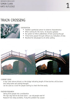
In pairs, this project involves investigating an area and observing people. Simon and I went about this by choosing a random person from Poole high street and following them whilst they go about everyday things. We took photos and written notes whilst doing this. By doing this it enabled us to then analyse our findings and spot a design intervention.

Here are the two posters that show our ideas, these were done for a presentation and wall pin-up.


After Easter, Simon and I joined up with another pair: Joshua Mitchelmore and Helen Sims. Below is the video and poster for our final project in second year BA Graphic Design. Watch the video and all will be explained!!


Essay work for year 2.

I am doing my 2500 written piece this term on the mobile phone company Orange. Specific areas I am looking into is Orange's brand and their advertisements, the way in which they communicate their brand through advertising.

My favourite ad campaign that I have seen so far is the website designed by Fallon in 2007. The campaign is called 'Good things should never end'. It is a prime example of how Orange communicates its brand more than their products and tariffs. Here is the link to this website (it can take a while to load, but believe me it is worth it!!)

http://unlimited.orange.co.uk/flash/go

After handing in our first draft of the essay, we were to produce a poster that contained all important information about our essay. This is in preparation for next year when it will be marked, the posters were pinned up and we presented them to the class.


Text, Sequence and Interaction


The Miner's Strike: I produced a flipbook that conveyed the battle between the police and strikers at the Battle of Orgreave in 1984. Here are a few photos of the final product.


Here is the video of the individual pages so as if to give the effect of the flipbook.

The Miner's Strike of 1984 flipbook from Kate Rutledge on Vimeo.

Little Red Riding Hood: In groups this section of the project was to take an existing story and illustrate it in our own way.

Little Red Riding Hood from Kate Rutledge on Vimeo.