Tuesday, May 3, 2011

EMP further work

These are my final seven hand drawn posters showing the 7 stages of Alzheimers Disease. They were drawn onto GF Smith bright white paper 120 gsm.


Experimentation:

Drawing the tree rings using a silver pen.


Silk screen printing onto a sheet of wood. I really like this effect, the white really stands out and it relates it more to tree rings. However the perfect circles makes it look quite like a shell or fossel, thus making it not relate so much to the human body and mind.


Silk screen printing.


White on white. I love this effect, it makes it quite hard to see but when the light shines on it from different angles it looks very beautiful. Also relates it back to memories fading.

Monday, March 21, 2011

Alzheimer's survey

My EMP of third year project is on Alzheimer's Disease. I would be extremely grateful if anyone could do this survey for me. It will take about 2 minutes :) xxxx

Click here to take survey

Friday, March 18, 2011

maps and tree rings


Experimenting with different thicknesses of fine liner pens and types of markings. Markings obtained from a book on graphic and map symbols.


Here I have illustrated four of the 7 stages of Alzheimer's disease, using the idea from the quote relating it to dutch elm disease. All four were done using a 0.3 fine liner on plain white paper and using a lightbox.


Experimenting more with showing the idea of the image dying from the inside out, memories being taken away from the subject. Shape created by tracing around a photograph of an actual tree stump with a hole in the middle....>

Looked back at old research on memories and Alzheimer's disease. Found the quote "Alzheimer's is like a tree with dutch elm disease. Dying from the inside out." Since my work is using tree rings as a metaphor for displaying the memories of a persons life, then this quote gave me an idea to produce the image above, where I am conveying Alzheimer's in a way that should appear beautiful and delicate. Therefore aim is to make it a subject to be talked about and the stigma about the disease removed.


This image was produced using a 0.3 fine liner and using the American road map symbols.
After looking at contours and maps, this lead me to look at the line and dash types used on different maps. I felt this was a good way of showing these rings since it related more to the idea of mapping the brain and memories, but also the journey of life in memories. These line markings above are from the UK ordnance survey map symbols.

Wednesday, February 16, 2011

Further work for EMP


These three photographs above I took with my macro lens, the idea stemmed from the tree rings, and the concept was that the typography on the paper was the memories (in this case I wrote out numbers in a sequential order to represent the memories of birthdays) and by curly the paper up when looked at from a birds eye view it resembled quite like the rings from tree rings.


These four illustrations above are demonstrating a humans life span in a way similar to tree rings. The average age that a female in the UK will live to is 82 years. So in this illstrations I have produced 82 rings of different strokes and distances to represent the memories in an individuals life.

This image above, is using a similar idea as the previous tree ring illustrations but I have tried to set it out in a more graphical way where it might be easier to understand the idea.

Looking at tree rings as a way of showing memories. How they resemble a human's life span of a memory. This image above is meant to represent the idea that recent memories are more vivid and you remember a larger context of the memory. Rather than a memory from a long time ago where you hardly remember anything about it.

From my scanning of diana prints my idea led on to taking photographs in a way that would produce effects portraying a memory fading away. Here in this photograph above, I used a long shutter speed and f22, to achieve a blurred, fading away content.


Using memories as a basis for my work and ideas. Decided to play with photography as a medium, since photographs hold all our memories. Exploring ways in which I can illustrate a memory fading, I used my old diana prints and the scanner to give interesting outcomes.

Wednesday, January 26, 2011

4 Experiments


First week of our EMP brief was to spend 4 days doing 4 different and new experiences.

1. Learning to play the Ukulele.


2. Being in an Austrian bar and not understanding anything being said.


3. Experiencing skiing down a mountain in the dark, feeling scared and confused.


4. Watching a documentary I know nothing about.

'The Brain: a secret history' watched on BBC iplayer. Though the most interesting part of the program that I found was this clip:


This led me to think about human testing, psychology and ethics. My response to watching this was very simply this:


Traveling

Over the christmas holidays I went with my family to South Africa. I am now realising the importance of experiencing and seeing new places and environments. I found the trip very inspiring and since my 'not just fleurons' project was coming to an end it was the perfect opportunity to be thinking up ideas for my Extended Major Project. I found the country incredible due to the divide between the richer and poorer people, some sights were very overwhelming and others were just like being in a city like London.

As far as graphics goes, this penguin logo for the penguins at Boulder's beach near Cape Town was probably the nicest bit of design I saw.


This trip made me realise how much I enjoy taking pictures of the people of a country in order to capture the mood and feel of the country. I now strongly believe that even though the sights and views can be magnificent, it is only after meeting and watching the locals go about their daily lives that you really see what a country is like. I would absolutely love to spend time photographing people from all over world! I think by doing this, it would open up my eyes and allow me to have the inspiration to become the designer I really want to be.


Saturday, January 8, 2011

Deadline


I haven't updated this for awhile, but I had my Specialist Project hand-in yesterday so now I have a bit more time! My last post was about flowers, pixels and numbers. The brief was an ISTD competition brief called 'Not Just Fleurons'.
On November 26th I started my final piece and approximately 163 hours later on January 3rd 2011 I finished it.
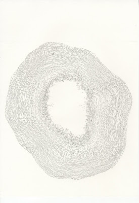
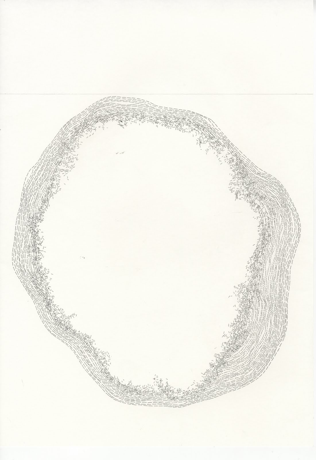
This typographic piece is made up of approximately 130,572 numbers. The flower (a marigold) is made from 14,508 (approximately) pixels, in the form of RGB numbers.

Since climate change is a very topical theme in the current environment, this typographic piece portrays to the public the severity of climate change. Since each pixel of type represents a plant in the world that is under threat from extinction. Keeping the numbers as RGB with the relevance into that it is how humans essentially see relates to the idea of extinction. Since how we see the world and climate change is very important, and perhaps it is only when we are shocked with the facts and figures that we understand the truth and damage we are causing: It is in the detail that we realise the truth.


With the font at 10pt, the piece fits nicely onto A0. I think I would quite like to sell this piece. It would be a one off, and I would give half the money to a chosen charity (most probably Alzheimer's Society). If you think you would like to buy then please get in contact with me. Thanks

Saturday, November 13, 2010

Flowers and numbers

My current development with the ISTD brief... below are my images from the flowers I flower pressed.


After inspiration from looking into Fibonacci and the Mandelbrot set I decided to magnify one of my photographs of a flower. In photoshop the maximum zoom is 3200% and this is what that looks like:


I decided to write down the RGB of each and every pixel from the selected area shown above. I did this to relate to the idea of numbers and sequences I've research about. I then made the colour of each written RGB numbers correspond to the actual colour.


This progressed to this image below (which shows what the image would look like if I was to repeat this process over and over):


This is another idea, inspired from an image in a typographic book: